Support Insights - Addressing Bounce Rate on Sign-Up Forms

In today's support insight, we look at the bounce rate of a sign-up form. A client felt that too many potential customers were dropping off the sign-up form and was looking to make changes to mitigate this. There are several things to look at here:
- Is it clear what they are signing up for?
- Are the questions easy and immediate to answer?
- Are there too many questions (and/or too many in-depth questions)?
- Is the form free of anything distracting (i.e. links, too much other content)? Your form needs to be laser-focused on one thing - signing-up new customers.
- Is it mobile friendly? Since 2017 mobile web traffic has consistently hovered around the 50% mark, so this is important.
- Avoid asking for password confirmation, and definitely don't use Captchas - they are extremely irritating.
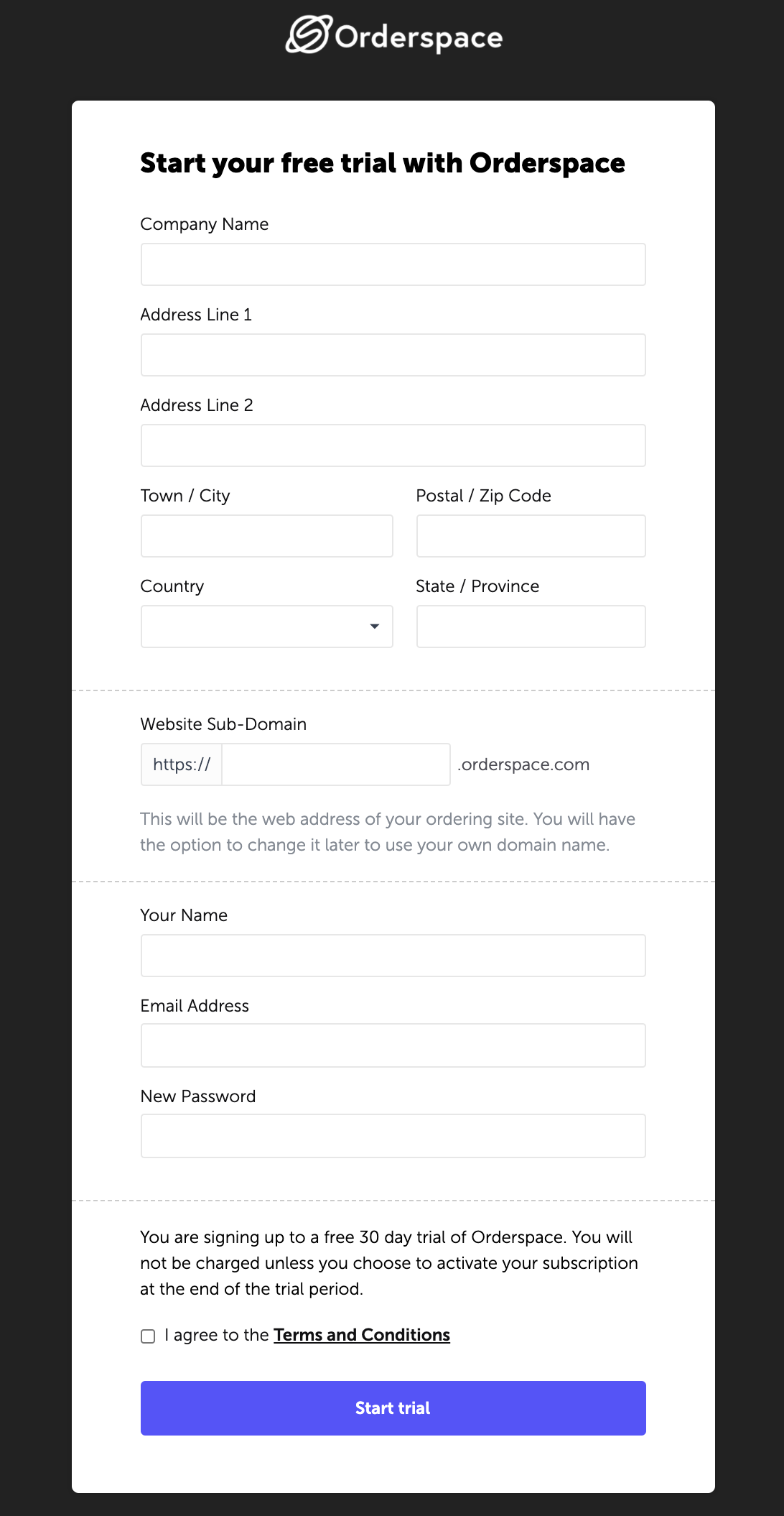
Here is the Orderspace sign-up form:

We ask for the absolute minimum information that we need to set up an account, and we are explicit about what they are signing up for. From this page, the user is directed to a 'Getting Started' process to set up their Orderspace site efficiently.
Further Reading:
Support Insights - Ordering on Behalf of a Customer
Five B2C Principles You Need To Apply To Your B2B Strategy
